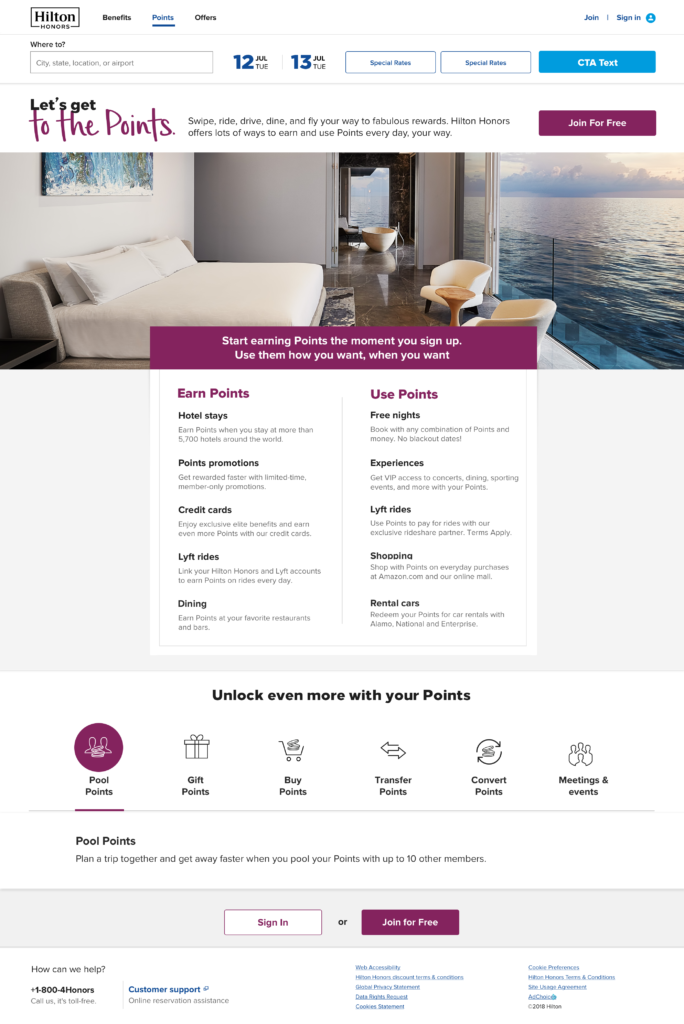
Portfolio

Storytelling at scale: creating 6,000+ hotel websites

This slide from a workshop deck shows how we decluttered the interface to help guests find what they need.

The objective

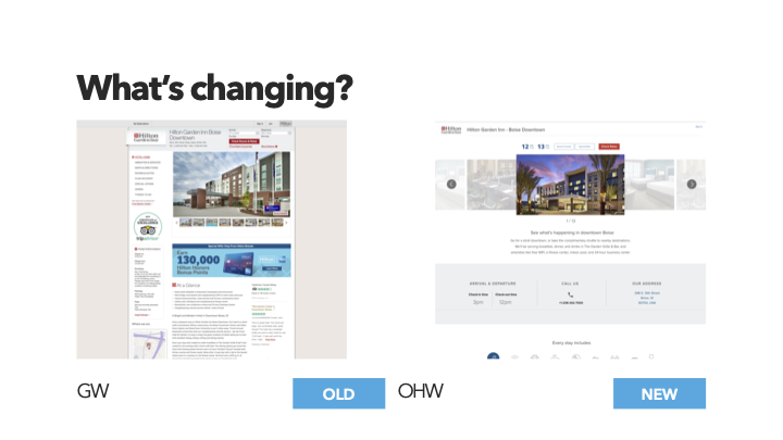
When we started, there were almost 6,000 hotels in the Hilton portfolio. Today, I believe that number is closer to 8,000. Migrating each individual hotel’s site using a new headless CMS allowed us to reimagine property content as reusable and shareable components.

A massive cross-functional endeavor

The all-hands-on-deck effort took partnership from every corner of the enterprise:

  • Agile product team (pod)
  • UX, UI and research
  • Content operations
  • E-commerce, our key stakeholder
  • Freelance and contract copywriters
  • Project managers

The scope of the project introduced me to people and orgs I wouldn’t have met otherwise, and resulted in lasting connections — so valuable in a global corporate environment.

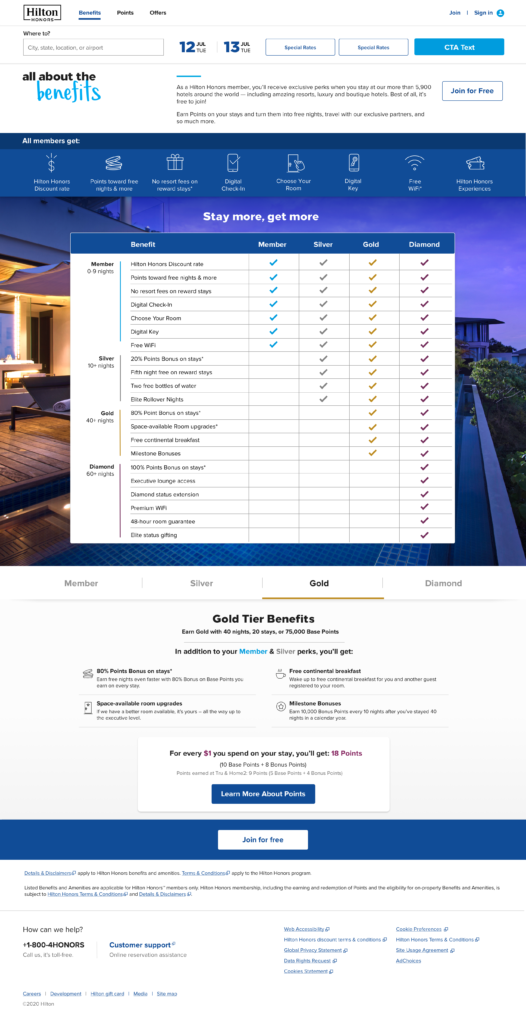
Content governance, copywriting, and editing

I inventoried and audited the existing website and content sources, looking for areas where we could rely on our property information manager (PIM) to supply content. I facilitated the creation of new descriptive copy where structured data wouldn’t fit. The PIM was full of good info — but since many of the fields were open-text, the data needed to be cleaned up before it could be used.

Excerpt of a spa page content inventory

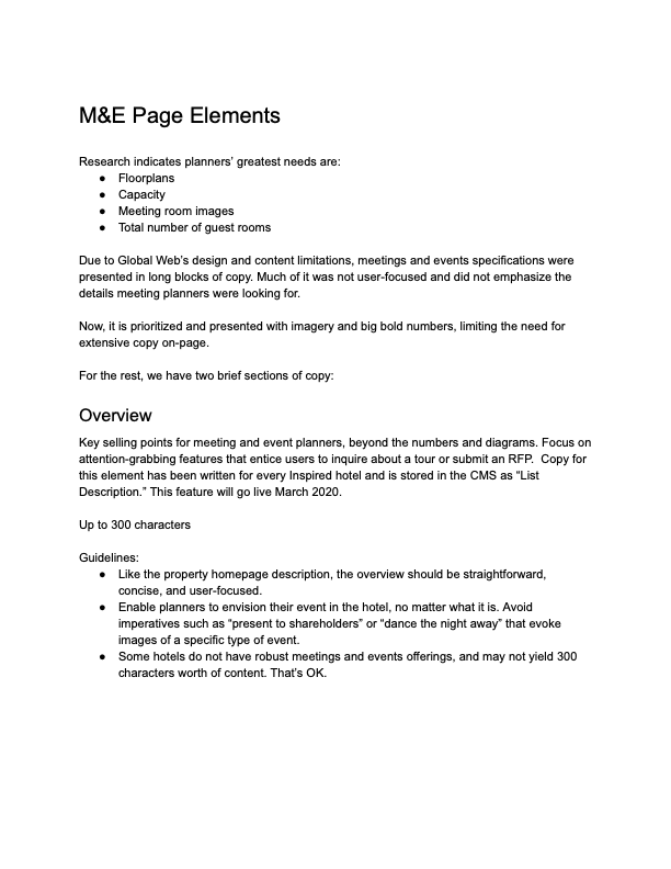
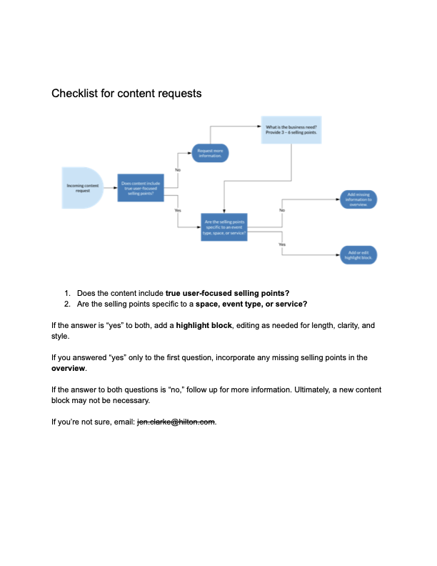
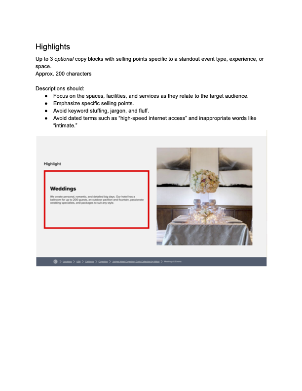
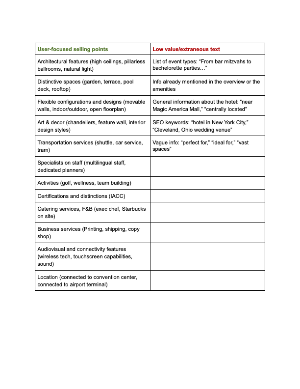
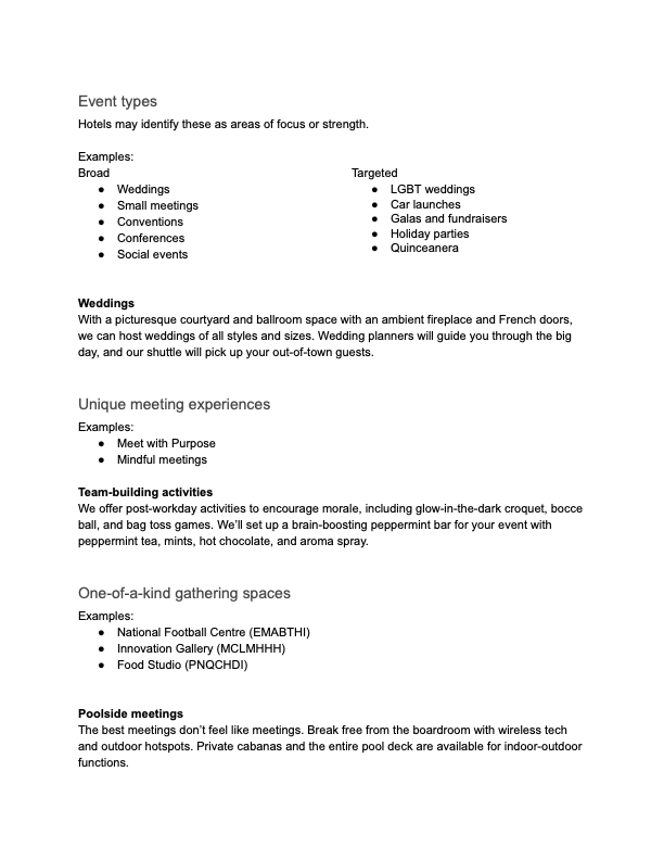
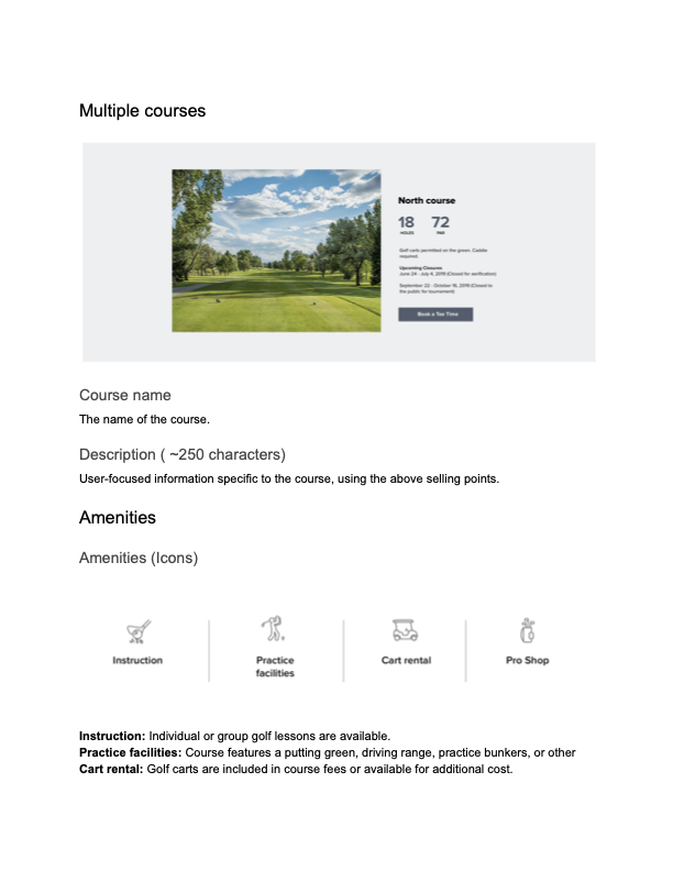
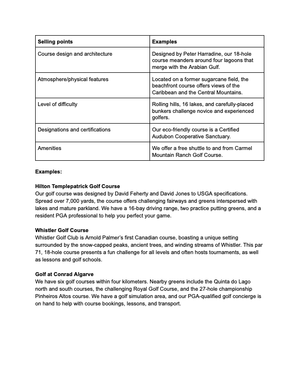
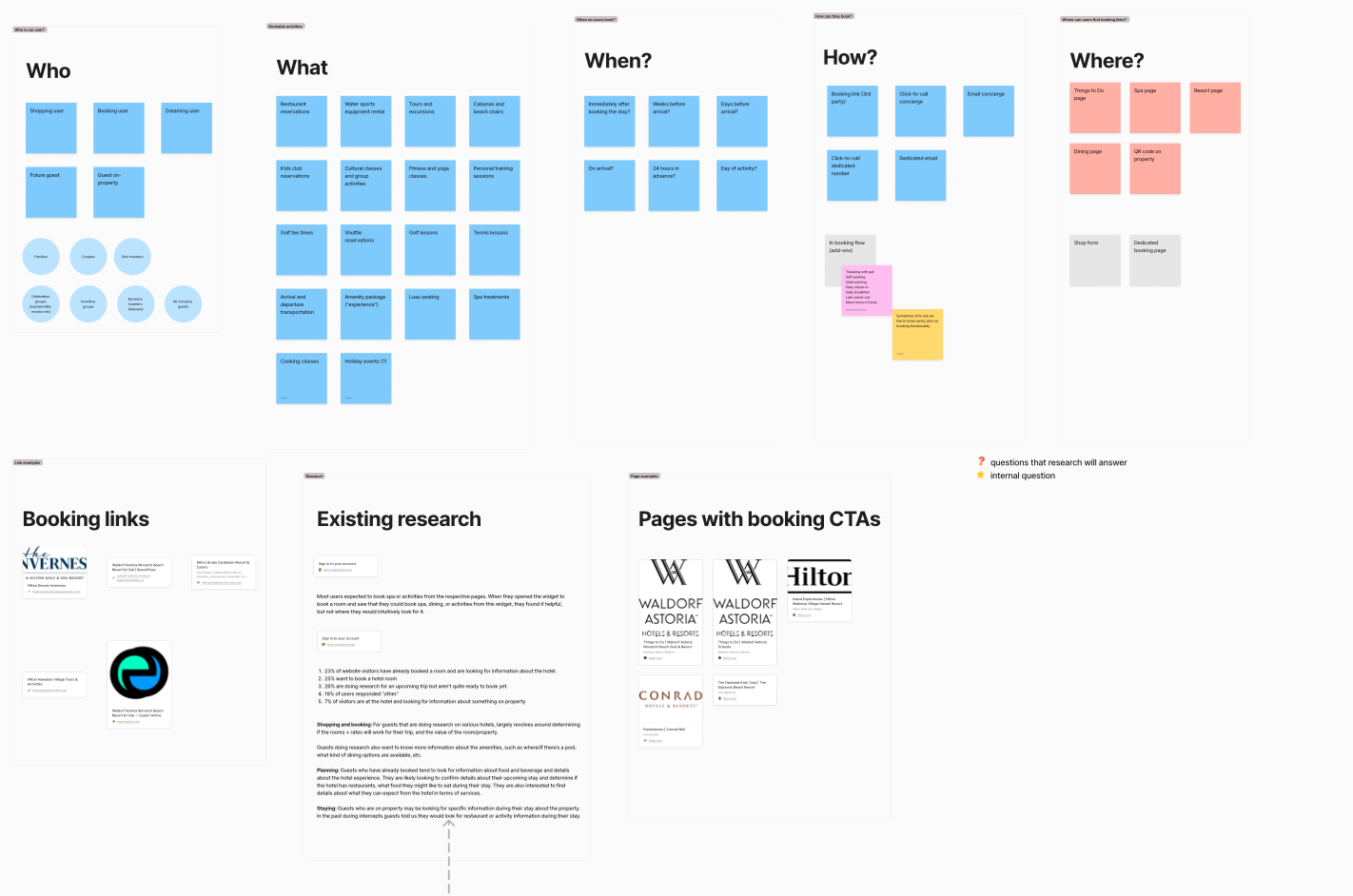
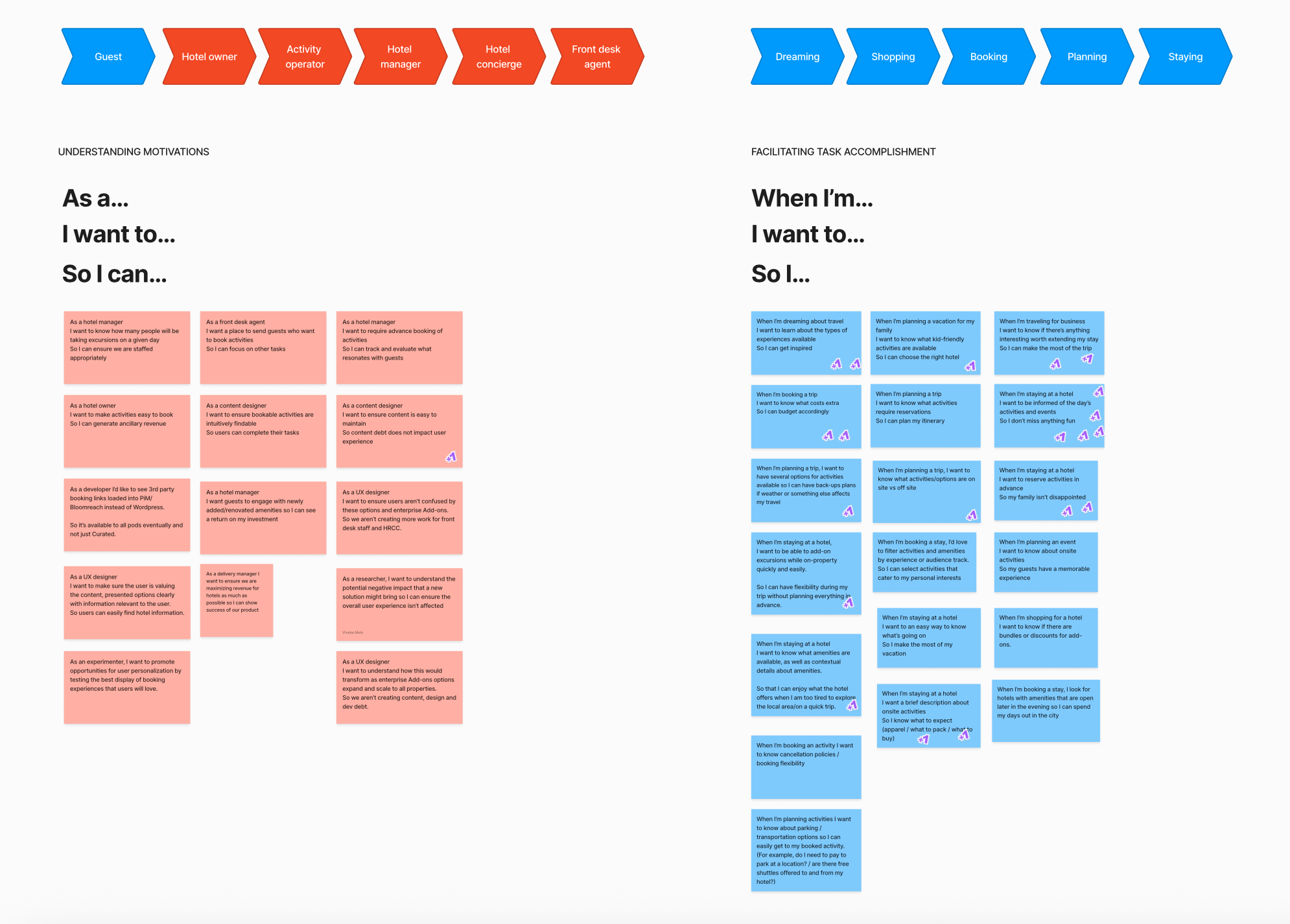
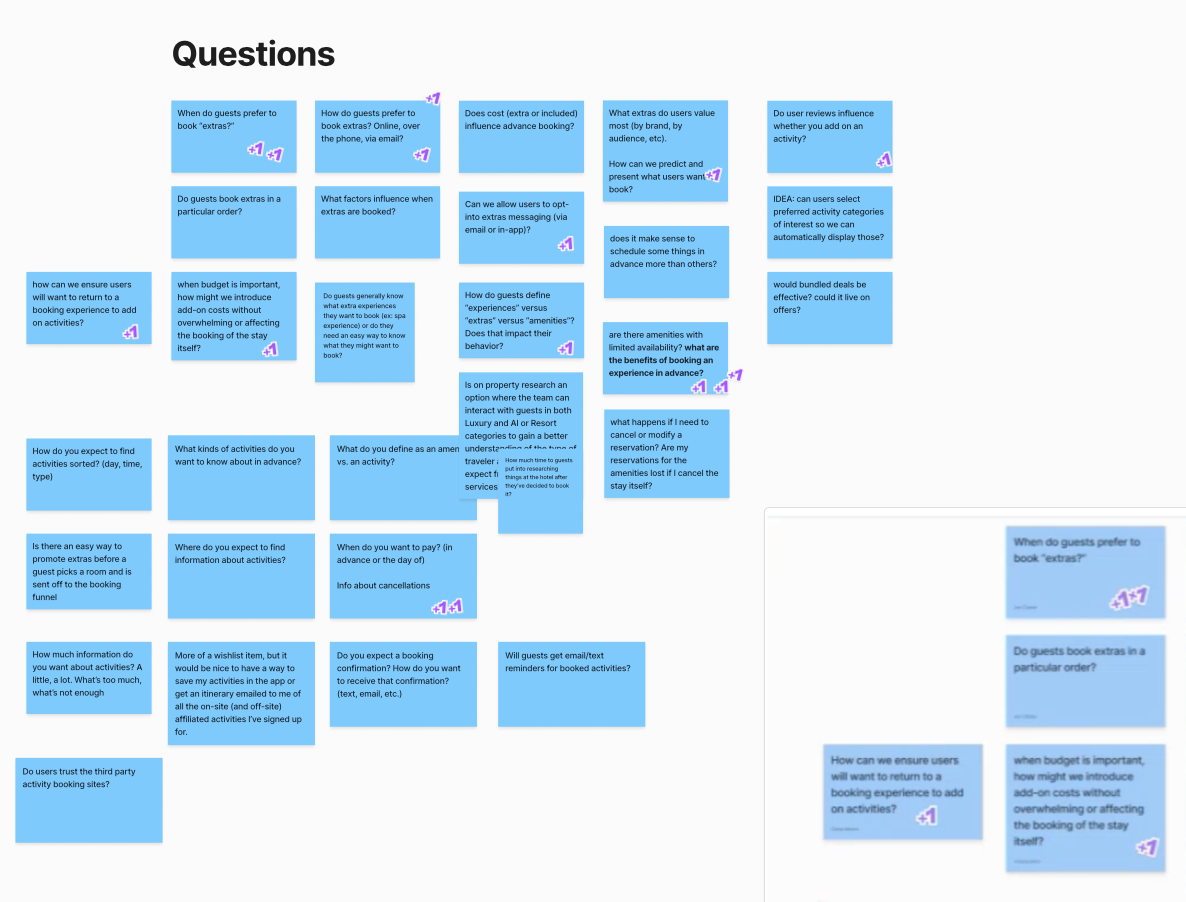
To create the new descriptions, I led a team of 4 – 6 freelancers (flexing with workload) through a series of sprints. Using our research and my knowledge of best practices, I created writing guidelines and trained them to identify key selling points by using personas and desk research, as shown:

With the help of partners on the content operations team, I edited the copy and packaged it for batch import every other Friday for several months. By my back-of-a-napkin calculation, I oversaw the creation of at least 20,000 pieces of content.

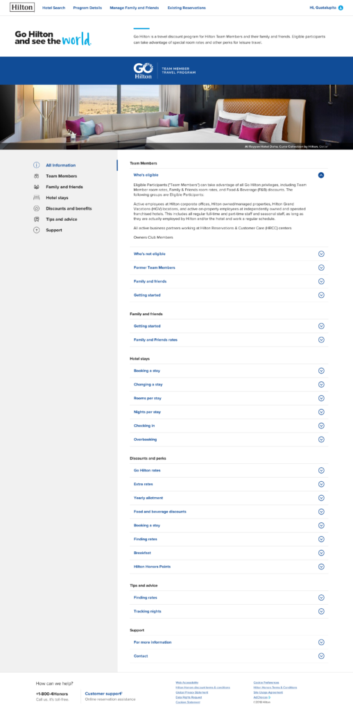
Content lifecycle and stakeholder management

Hotel stakeholders were understandably cautious about all the changes. I communicated regularly and openly with the e-commerce manager and gave her thorough documentation so she could to respond to pushback and help them trust the process. She and her team worked with the hotels to clean up their PIM info and meet requirements for new content. Together, we were able to resolve issues quickly and stay agile.

I hosted workshops at key phases to explain new features and help the teams responsible for maintaining the sites minimize content debt. With access to the data that informed our design decisions, they were able to triage change requests more efficiently and prioritize their backlog.

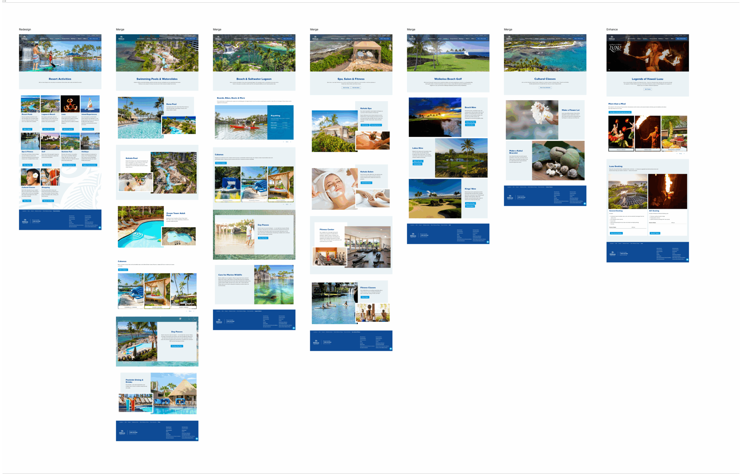
Bringing bespoke luxury to the web

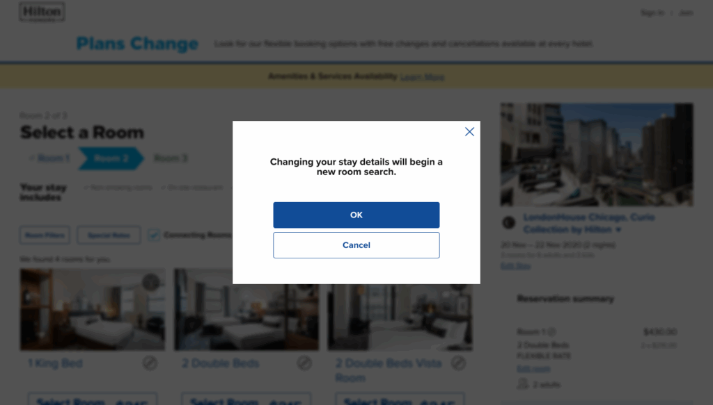
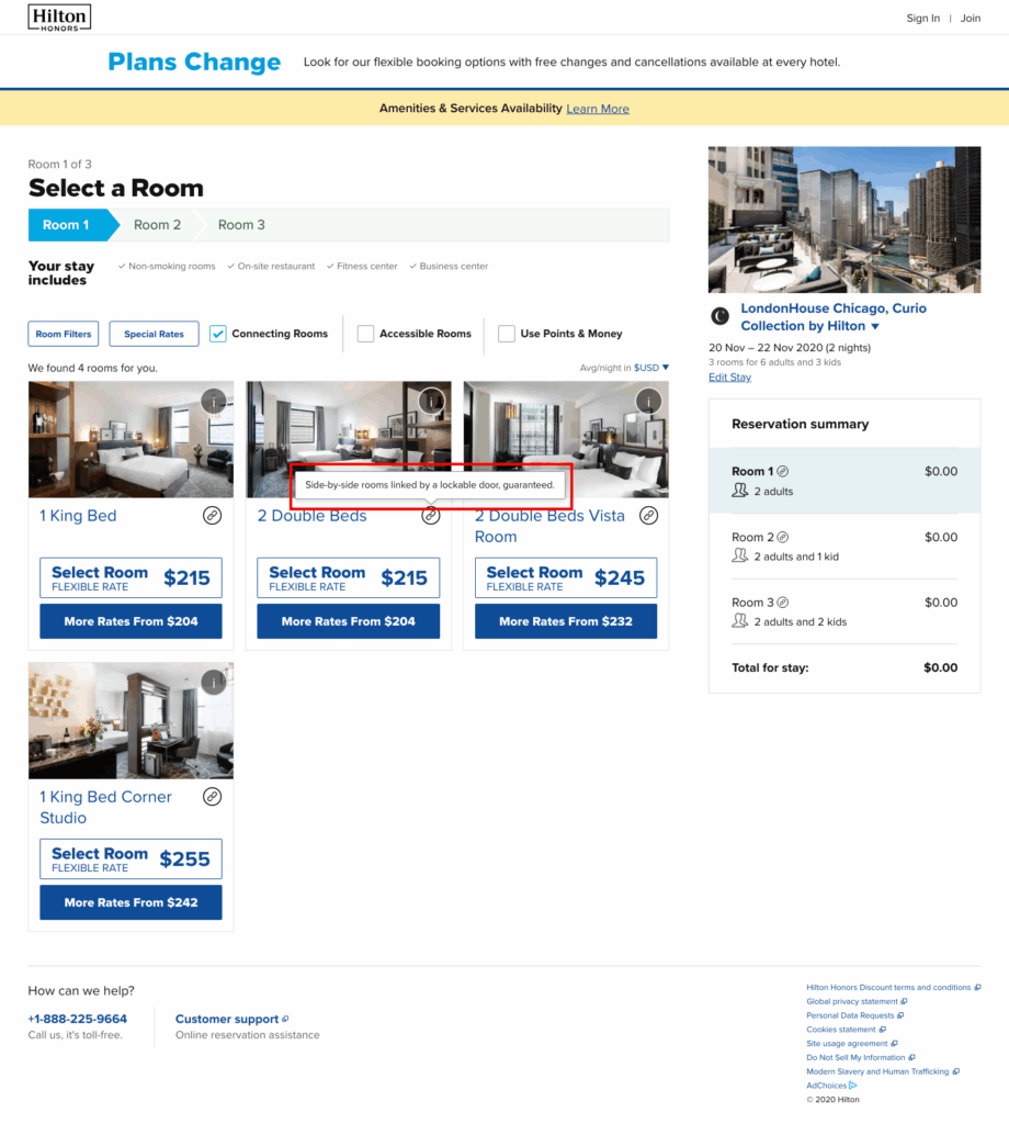
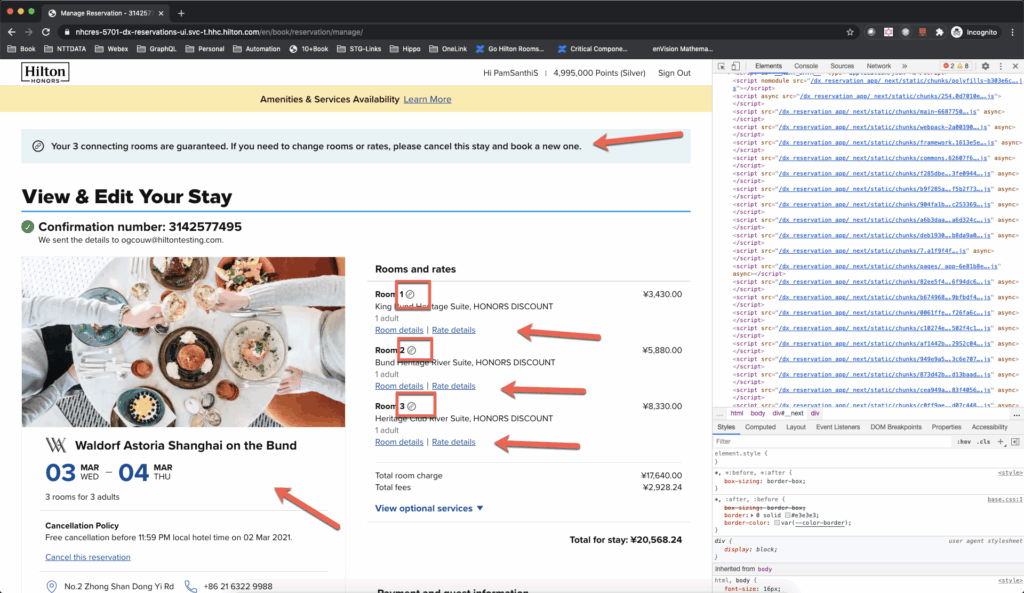
Our final obstacle to decommissioning legacy Hilton.com was a group of hotels with complex content needs. Once we’d migrated the other 99% of the hotels, I turned my attention to these.

Hotel loyalty site redesign enhances user experience and security

Redesigning Hilton.com gave us a chance to make the site more secure, more personalized, and easier to use.

Objectives

Loyalty is critical to hospitality business and Hilton Honors is one of the biggest hotel loyalty programs in the world. To support evergreen goals of increased member occupancy percentage and revenue, loyalty messaging reaches users at just about every touchpoint, aligned to these themes:

  • Acquisition: encouraging users to join for the benefits (both real and perceived)
  • Engagement: encouraging members to take advantage of the program
  • Recognition: celebrating members and rewarding their engagement

What I did

Writing for this experience took a careful balance of push and pull, and figuring out when to lean into each theme. Conveying those sentiments in a scannable interface, while explaining the complicated algebra of points and miles, was another challenge.

My framework emphasized

  • centering the member “choose the benefit that suits your style”
  • sensory, active terms designed to excite “Swipe, ride, drive, dine, and fly”
  • community and exclusivity “As a Gold member, you get”

Page-by-page

Getting to the Points with content design

Condensing more than a dozen pages of repetitive content into a tidy one-page overview.

Simplifying loyalty program perks

Trying a different way to work with stakeholders helped balance business requirements and user needs.

Helping employees use their benefits

Full-time employees at Hilton get an allotment of discounted room nights to use and share with friends and family. But there are rules. I made them easier to navigate and understand.

Sustaining content lifecycle with governance artifacts

I love a paper trail. Documentation brings structure, it helps keep things consistent, sometimes it answers “what were we thinking?” I create a playbook for anything that can be repeated or scaled: pages, components, error messages, and so on. I keep these as lo-fi as possible and plug the information into presentations or Confluence pages or email chains customized to individual stakeholders’ needs.

What’s included

  • Background explaining what has changed and why
  • Objectives for the content and its intended audience
  • Content requirements including character count and terms to use or avoid
  • Best-in-class examples and examples that don’t meet requirements
  • Decision framework for approving and implementing changes
  • Rubric for evaluating quality and value

Meetings and events

Golf

Project management principles and practices

Via Coursera, I completed a specialization in project management principles and practices offered by the University of California, Irvine. The program is just right for professionals who want to better understand the role of a PM and incorporate some of their practices in their own work before investing in a project management certification.

The program covers initating and planning, budgeting and scheduling, and change and risk management, concluding with a capstone project.

The capstone requires learners to manage a real or made-up project and is peer-graded on seven artifacts:

  • Project charter
  • Work breakdown structure (WBS)
  • Sequence
  • Schedule
  • Budget
  • Risk assessment
  • Responsibility assignment matrix (RAM)

I created a full-blown Gantt chart, budget spreadsheet, a RACI with dropdowns, plus a WBS and sequencing diagram in Miro for a yearlong celebration of my imaginary company’s 40th anniversary. I may have committed some scope creep with the scale of my submission, but I’m excited to apply what I learned to future content strategy projects.

Demystifying payment security online

With digital payments’ rising popularity, fraud is a growing concern for the hospitality industry. Credit-card chargebacks cost significant time and money, leading to preventative enhanced security measures like strong customer authentication (SCA). SCA requires a two-factor verification before processing payment. In some parts of the world, it’s a fact of life, but it can feel disarming to someone encountering it for the first time.

While we were optimizing our SCA experience, a product owner on the payments program team reached out with a separate request to review an FAQ page that had been created to explain payment verification emails some years prior. These emails were no longer being sent: Should we do something else with the page or just delete it?

My stance on FAQs has softened over the years because of use cases like this one. Since SCA happens via the user’s credit card provider, our options for clarifying and reassuring within our own UI were limited. Plus, we had recently expanded digital payment methods with more enhancements planned.

When I considered intuitive places to talk about payment security, my next thought was almost always “OK, but who will see it?”

So I redesigned the page with real frequently asked questions.

Hilton payment FAQs

Why it works

  • Translates complex concepts into plain language.
  • Content is search-friendly and LLM-friendly.
  • Content is legally compliant (after only one round of review!) and consistent with brand tone of voice.
  • Anchor navigation and semantic headings allow for further expansion.

Solving hotel booking challenges together

What is the problem you’re trying to solve?

I’ve asked this question so many times, it’s become a catchphrase. But when stakeholders approach with ready-made solutions (and artifacts, sometimes!) getting to the root of the issue can reveal a different approach.

One hotel requested a feature they had on their self-hosted microsite. They wanted to replicate it on their branded site. We knew the problem the hotel was trying to solve: they wanted to make it easier for guests to book ancillary services, like spa treatments and restaurant reservations.

My team wanted to solve the same problem, just not in the same way. We knew at our phase of the journey users are seeking information, so we needed better ways to share it. The hotel’s solution presented a lot of risks: technical complexity, scalability, security, and potential operational challenges at the hotels. There was also another team working on an enterprise initiative to solve the problem.

This was a design opportunity. With our research partner, I hosted a workshop with all kinds of stakeholders: developers, product managers, delivery managers, designers and researchers working on related efforts.

What we wanted to do

  • Acknowledge the hotel’s challenges and demonstrate how we are working to address them
  • Understand user perceptions and behavior 
  • Learn where business and user needs intersect 
  • Collaborate and share information with other relevant teams 
  • Strengthen relationships with cross-functional partners through shared ownership of design and product decisions
I began the workshop by summarizing what we already knew, for stakeholders who weren’t familiar with the content and its purposes.
Workshop participants contributed user stories and job stories. This exercise confirmed that we needed to know more about users’ motivations.
From the user stories and job stories we generated more than 50 questions, which our researcher synthesized into objectives

What we accomplished

From interviews our researcher identified some opportunities to improve the user experience. The team was able to create and implement those quickly and focus on big priorities. We got the insights we needed to take to the hotel partner, so the product manager could help them understand why we couldn’t do exactly what they asked. Bonus: they were excited to learn about the upcoming enhancements. These impacts don’t always translate immediately to dollar signs, but building relationships with partners and trust with stakeholders can pay dividends in the long run.

A style guide everyone can use

The problem

At a large organization with many teams creating content, consistency can be a challenge. Our team designed the website and app products, but a lot of the words come from systems and from writers on other teams. Sometimes they come from UI/UX or product managers or developers. We needed a home for the style guide that anyone publishing on a digital platform could access, not a collection of forwarded PDFs that would vanish at the whims of the data retention policy.

Inspiration on the run

A guest on Kristina Halvorson’s Content Strategy podcast mentioned that her team used a “white-label Grammarly” to automate their style guide and I knew that was exactly what we needed. Unfortunately, I was on a run so I forgot about it almost immediately. But I later attended the Confab content strategy conference, where WRITER was a vendor! My memory was refreshed.

Making it happen

I’d barely unpacked my bags before I started researching WRITER and comparable products. When I was sure I wanted to proceed, I made the case to my leadership and pitched the product to my peers on other teams. That was the easy part. As a newer manager, I got a crash course in procurement from statements of work to security review.

Soft-launched in late 2022, the style guide

  • covers brand and marketing guidelines
  • defines industry vocabulary
  • sets standards for readable, usable, and accessible content.

Users could submit questions and suggestions via Airtable, and my team and I regularly deliberated on what should be included as products evolved and new programs launched.

Finding new use cases

In 2024, we expanded our relationship with WRITER to include its generative AI features for quicker content ideation, creation, and editing. We also introduced guidelines for internal-facing products that require specialized vocabulary and a more professional tone. These guidelines were socialized with product and business partners to help them better understand our methods.

Successfully scaling style

From June 2024 – June 2025, WRITER scanned more than 2 million words for our teams and offered suggestions for style, clarity, and adherence to brand guidelines. It has generated or rewritten 1.4 million words, saving countless hours.

Your friend, content design

Content design is identifying what users need and determining what content best suits that need. Sometimes that content is a PowerPoint presentation. This deck has inspired many “Aha!” moments among partners who are working with content designers for the first time.

Bklack text on a white background that says "Content is essential to human-centered design because language is essential to human interaction."

Small copy changes, big money impacts

Hilton added 100,000 rooms to its portfolio in 2024. On top of the yearly pipeline of new openings, the company acquired two brands and entered partnerships with two others. This marked a different approach — previous new brands like Motto and Tempo were built from scratch, not acquired. Integrating the new brands and partners into the digital experience was an all-hands-on-deck effort.

Throughout the website’s booking experience, chips highlight key attributes. One, simply labeled “New,” appeared in hotel search results next to new hotels. Business requirements limited the qualifying criteria to hotels built within a certain timeframe. A search filter for “New Hotels” used the same criteria.

A chance to enhance

Given the portfolio’s recent growth, we recognized that “New” may not be descriptive enough, and qualitative research confirmed our suspicions. Revisiting “New” would be the first step in clarifying these chips and filters for the user.

To start, I mapped out the different types of “new:”

  • just-built hotels
  • hotels that had been newly converted from other brands
  • hotels that had been reflagged within the portfolio
  • newly acquired hotels
  • and so on.

I pitched “Newly built” as the third variant to test against “New” and “New hotel” (this option was for parity with the aforementioned filter)

When it comes to UX copy, sometimes more is more.

Clear language makes a measurable impact

In a win for clear language, the “Newly built” variant increased clickthrough by 2.5% and boosted revenue per visitor by 1.5%. This revealed opportunities to experiment further and find better ways to highlight the many, many other types of “new.”

Refreshing optimizations for hotel websites

At the launch of the hilton.com MVP in 2019, hotel websites fit into two categories, according to their content needs and amenity offerings. About 99% of the hotels fit into one of these categories. Hotels in the remaining 1% would require a more customized solution. These sites began launching in 2021.

The original site for this massive Hawaiian resort merged its official Hilton.com presence with a 128-page “microsite.” After auditing and inventorying the content, I was able to condense the site to about 27 pages. I could have gone even leaner, but wanted to assure the stakeholder that I wasn’t taking anything away — just putting things together where it made sense. 

Before: content inventory revealed these pages as opportunities to simplify.

As the platform grew and alongside it the library of available components, the time came to revisit early adopters to the platform to refresh and enhance. When we had the bandwidth to reevaluate the site’s structure and content, I had the numbers to confirm my suspicions. There were too many subpages, and people weren’t visiting them enough. Eliminating some of the pages would reduce content debt and operational effort. Even better, it would improve the UX.

After: A much tidier website navigation

Using Adobe Analytics, I made a case for better optimizing the site for mobile users, who make up about half the site’s traffic.

Low effort, high-impact optimizations

  • Streamlined navigation and reduced clicks by merging five subpages into their parent pages
  • Moved the hero images below the introductory copy, so users could find information before scrolling
  • Component changes that enabled the use of bulleted lists and icons to make content more skimmable

Presenting these changes with the accompanying data and rationale helped the stakeholder feel like part of the design process, and helped him articulate the decisions and their benefits to his own leadership.

Some samples of my personal writing

For several years, I used my blog as an outlet to flex writing muscles I wasn’t using in my professional life. Due to many factors — other hobbies, lack of time, etc — I don’t get to do as much personal writing anymore. But here are a few pieces I’m proud of:

Word of the year, 2022

In yoga, an intention is a singular virtue or quality you hope to attain through your practice. It can be a word, a phrase, a mantra — whatever you need in the moment. To me, this centering act marks a beginning, a blank page, a clean transition from everything that came before it. For a few years now, I’ve carried this concept off the mat and started each new year with an intention to guide me through.

This is different from a new year’s resolution because it’s not something that can be failed. It’s not a goal with targets and deadlines and measurements. It’s a value statement, an objective, a North Star I search for after processing the previous year.

Good at words, bad at eggs

2020 will be remembered for a lot of terrible things. For some of us, it will also be the year we baked a crusty sourdough boule/started a podcast/grew 59 indoor plants. It’s a gossamer lining when a pandemiceconomic despair, and civil unrest await outside our locked-down doors.

But hey, I can cook all kinds of eggs now.

Five signs it’s time to move on

Perfect jobs — free of stress, conflict, and the occasional red tape — don’t exist. But your workplace frustrations also might be a sign you’re in the wrong place or a symptom of organizational distress.

Automated hotel room upgrades

An industry-leading feature, automated upgrades allow elite loyalty members to use contactless check-in features without sacrificing potential upgrades. These upgrades are awarded 72 hours before a guest’s stay, at which point they receive an email or push notification.

The challenge

Hotel guests cite the potential for upgrades as a key (no pun intended) factor in their preference for front-desk check-in. They appreciate the personal touch and the human interaction — and after a global pandemic, this was more important to them than ever. However, due to the aforementioned pandemic, hotels had fewer resources available and needed to minimize crowding and close contact for health and safety reasons.

The solution

We identified moments in the experience where we could recognize members’ loyalty and invoke the same “surprise and delight” they feel at the front desk. In a collaborative effort across multiple delivery pods and cross-functional teams, I provided onboarding and celebratory messaging across platforms and throughout the user journey.

Why it works

  • “Confirmed” reassures the guest that they don’t need to go to the front desk to request an upgrade
  • “Complimentary” reassures the guest that they will not need to pay extra for their new room
  • “Thanks for being a Gold member!” uses familiar language — the exact words front desk agents use! — and reinforces that the upgrade is a benefit of their membership and a reward for their loyalty

Leading luxury hotel content migration

I led content strategy and design for the migration of more than 100 websites for luxury hotels, resorts, and hotels with other complex content needs using multiple content management systems and structured content and property data.

The challenge

A small cohort of hotels were not effectively served by the new enterprise hotel website solution. The team was not able to migrate these hotels’ web pages to the new platform alongside the other 6,000-plus properties, which delayed the decommissioning of some legacy services. Many had contracted with the in-house creative agency or external agencies to create microsites that met their storytelling needs. However, these sites led to missed SEO value, brand dilution, contradicting info, and guest confusion.

We wanted to

  • eliminate the need for microsites
  • use enterprise content and property data systems for centralized updating and greater accuracy
  • incorporate the terminology, taxonomies, and information architecture used on the other 6,000+ sites
  • ensure adherence to guidelines for visual branding and tone of voice

What I did

  • Collaborated with design partners to develop and grow a flexible component library that delivers information and images in the most usable and accessible formats
  • Established guidelines, workflows, and best practices for content creation and maintenance
  • Developed templates and a rapid wireframing process that allowed content editors to design and build pages quickly
  • Wrote user-focused, search-informed copy infused with luxury tone and brand voice
  • Led a team of content designers and acted as trainer, editor, and project manager
  • Worked directly with hotel stakeholders to understand their requirements and identify how to best tell their stories

Hilton unveils new tech enhancements for guests

One of the factors slowing digital key adoption among hotel guests was the inability to share a key. Digital Key sharing was one of many innovations fast-tracked by the covid pandemic and its necessity for physical distance and leaner staffs. I wrote the screens for the experience.

From HospitalityNet:

In a first for a major hospitality company, Digital Key Share will allow more than one guest to have access to their room’s Digital Key, which turns the free Hilton Honors app on their smartphones into a room key.

Confirmed Connecting Rooms help friends and families connect

Another hospitality innovation introduced in the post-covid “revenge travel” era. By eliminating the need for a phone call, Connecting Rooms make life easier for front desk and call center agents as well as guests.

From The Points Guy:

Hilton even acknowledges that booking connecting rooms hasn’t always been seamless. Previously, you had to call or otherwise reach out to your hotel ahead of time to request a connecting room. While hotels rarely guarantee it, many typically accommodate the requests if possible — but you wouldn’t find out until arriving at the hotel. Other hotels, such as Marriott and Hyatt offer connected rooms, but they aren’t guaranteed — and can cost you.

Naming the feature

I, personally, did not name “Confirmed Connecting Rooms by Hilton.” But, we were involved early enough that we were able to validate the name with users to make sure they understood the feature. Connecting rooms are also commonly known as adjoining rooms and there is another in-stay product with a similar name. I advocated strongly for “connecting” given the double meaning, plus my desk research indicated that it was more commonly known.

Defining the feature

“Side-by-side rooms linked by a lockable door.” I wrote a descriptive line that could be used just about anywhere, from tooltip to tagline. The alliteration and and rhythm made it easy to remember.

Onboarding the feature

We introduced a new component to flag the new feature at relevant points in the experience. It was important for us to remind users that it was innovative and unique in the industry.

Clarifying the experience

Since the feature was new, we had to earn users’ trust. I wrote alerts and instructive copy to reassure at every step, so future guests would feel confident that they didn’t have to call the hotel.

Helping employees use their benefits

Hilton employees and approved friends and family members are eligible for generous room discounts. This page previously detailed the specifics of the program in FAQ format, which should not be the primary source of information. Intuitive groupings and scannable copy in plain language create a more navigable experience for both audiences.

Go Hilton program information page

To ensure users understood the terms, I also wrote a series of friendly and instructive error messages to simplify complicated situations, including:

  • When the user is out of nights
  • When the user has a Go Hilton stay booked during the chosen dates
  • When the rate is no longer available because another user has booked it (with more than 150,000 employees, plus their friends and family — you snooze, you lose)

Later enhancements included the ability for employees and their family and friends to limit their search results to hotels with available Go Hilton rates.

Simplifying loyalty program perks

Screenshot of loyalty program perks page

A single source for information about loyalty perks that offers a more direct, concise and user-friendly breakdown than its text-heavy predecessor.

Challenges

  • Research indicated that users preferred the ability to compare tiers side-by-side, which presented challenges for accessibility and the responsiveness of the design
  • Users preferred a high-level, more practical overview of benefits, while stakeholders wanted to use the page more to market the program in general. Similar conflicts had caused previous pages to stall in revision.

Finding ways to work together

Understanding a partner’s feedback style and meeting them where they are can break down barriers to productivity. I recognized that with multiple stakeholders and a chain of approvers, a copy doc just would not do. To limit the amount of back-and-forth, I recommended a peer editing session with two of our key partners. I shared my screen and walked through the copy in a prototype, explaining rationales and noting feedback along the way. The result? A much smoother ride from concept to delivery.

Getting to the Points with content design

While hotel stays are the primary method, the Hilton Honors program offers members several other ways to earn and use Points. Users weren’t aware of these flexible ways to maximize their membership, despite the information being readily available.

Fewer clicks, more context

The experiences and dining platforms, partnerships, and transfer/gifting/pooling features required users to link their accounts on a vendor’s site, which essentially meant that each feature had two landing pages. We condensed about 14(!) pages of this repetitive and confusing content into this tidy one-page overview.

Signed-in members see a different but similar version of this page with relevant links, personalized with details including their number of available Points.

Screenshot of hotel loyalty program website.

Why it works

  • Data-informed hierarchy matches users’ ranking of features as indicated by research.
  • Use of headings and short, succinct copy quickly gets the point across (no pun intended).
  • Active voice centers the user and their personal benefit.

Scaling style with shareable guidelines

When we migrated 5,000-plus hotels to the new hilton.com, we moved to a headless content management system and transitioned product copy to skimmable, structured and tagged short descriptions that highlighted key selling points and were optimized for readability.

This was a big change from the long-form, keyword-stuffed paragraphs that hotel stakeholders and other key partners were accustomed to. It required a mindset shift for our e-commerce stakeholders and the copywriters responsible for updating and maintaining hotel descriptive content.

With a UI designer’s help, I created this handbook to explain the framework for our fleet of freelancers and the teams who would be responsible for writing hotel descriptions in the long term. Cheekily named “How to Write Good,” it was the first of many documents I created for the project to help define and clarify the strategy.

Some excerpts from the 10-page handout:

Why it works

  • Specific examples of what to do and what not to do give context
  • Friendly tone reassures team members adapting to the new strategy
  • Clear language is accessible to audiences who aren’t style, grammar, and usability geeks