At the launch of the hilton.com MVP in 2019, hotel websites fit into two categories, according to their content needs and amenity offerings. About 99% of the hotels fit into one of these categories. Hotels in the remaining 1% would require a more customized solution. These sites began launching in 2021.
The original site for this massive Hawaiian resort merged its official Hilton.com presence with a 128-page “microsite.” After auditing and inventorying the content, I was able to condense the site to about 27 pages. I could have gone even leaner, but wanted to assure the stakeholder that I wasn’t taking anything away — just putting things together where it made sense.
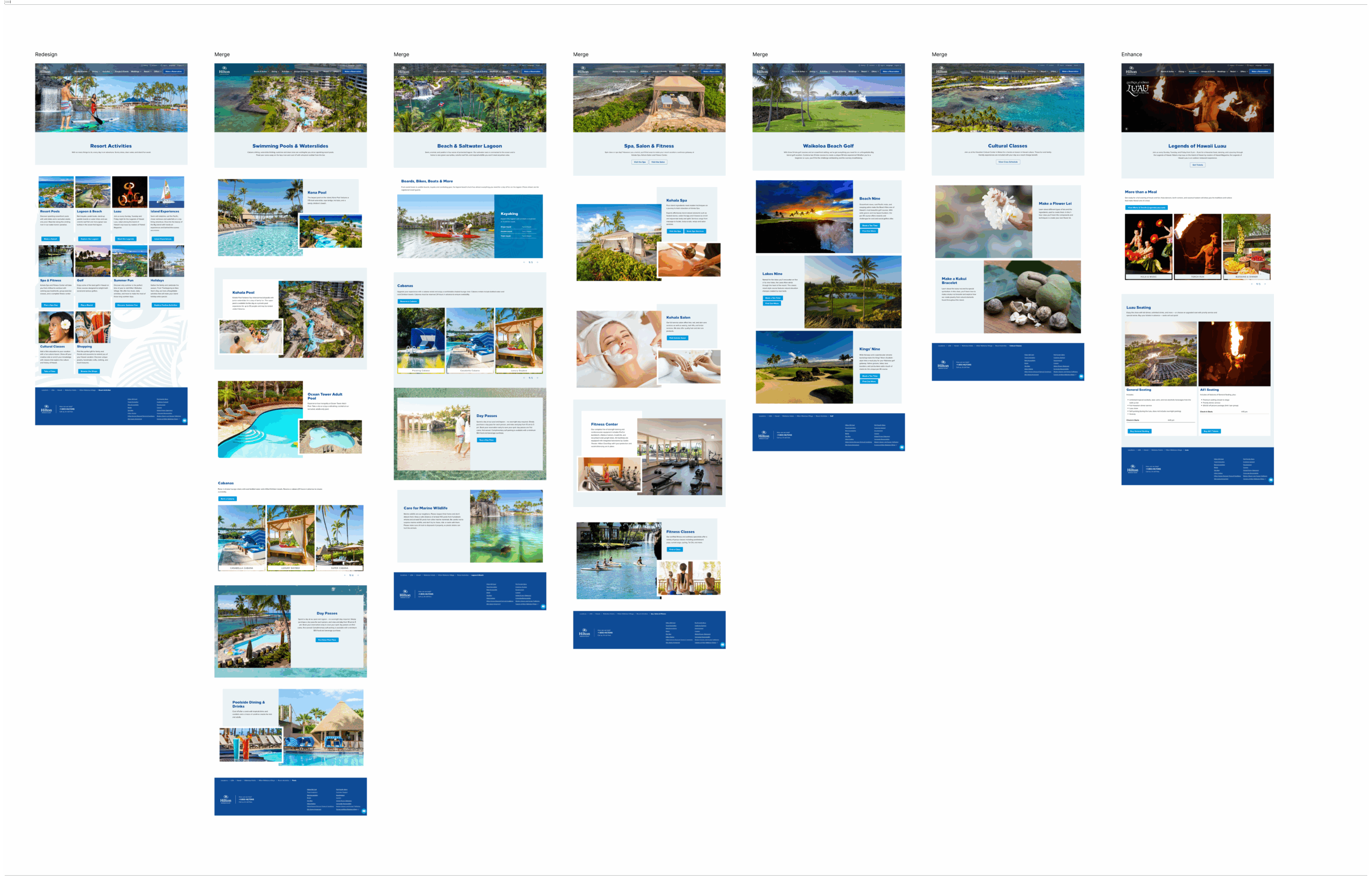
As the platform grew and alongside it the library of available components, the time came to revisit early adopters to the platform to refresh and enhance. When we had the bandwidth to reevaluate the site’s structure and content, I had the numbers to confirm my suspicions. There were too many subpages, and people weren’t visiting them enough. Eliminating some of the pages would reduce content debt and operational effort. Even better, it would improve the UX.
Using Adobe Analytics, I made a case for better optimizing the site for mobile users, who make up about half the site’s traffic.
Low effort, high-impact optimizations
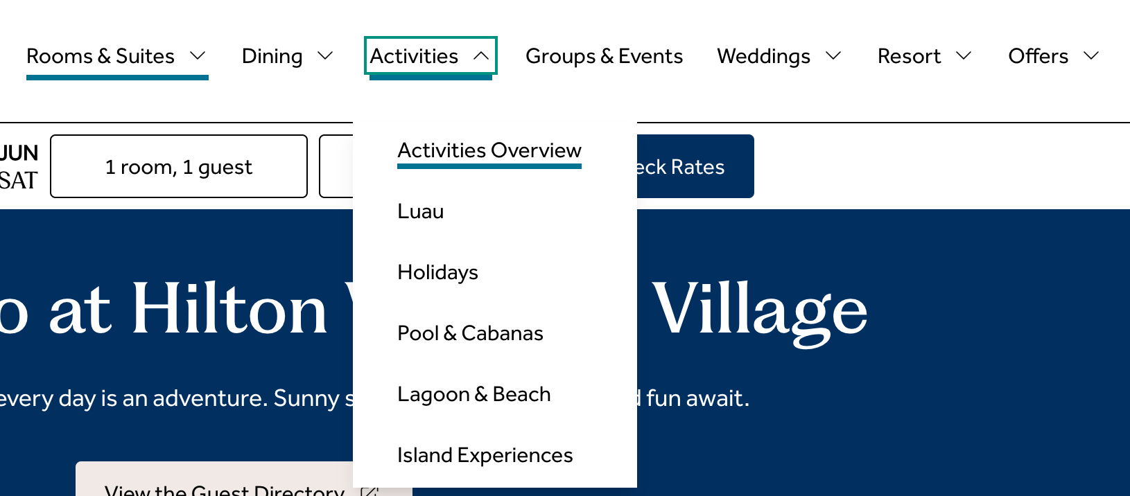
- Streamlined navigation and reduced clicks by merging five subpages into their parent pages
- Moved the hero images below the introductory copy, so users could find information before scrolling
- Component changes that enabled the use of bulleted lists and icons to make content more skimmable
Presenting these changes with the accompanying data and rationale helped the stakeholder feel like part of the design process, and helped him articulate the decisions and their benefits to his own leadership.